
This papyrus map dating back to ancient egypt was found in a modern day tomb near the modern city of Lexor. It is reportedly from sometime between 1839- 1057BC.
 Cave drawings are beleived to be some of the oldest forms actual maps such as this one that is beleived to be from 20000 years ago that wasfound in Europe.
 The isotherm lines on a map are the lies that bring together areas of the same temperature. This is what we typically see on weather brodcasts. The areas of similar temperature are then shaded in with the appropriate colors typically wih greys and blues representing cold temerature and oranges and reds meaning high temperatures.
 A stem and leaf plot allows the information to be charted acording to frequency. This exammple plots how may birds visit are visiting the feeder.


 I was shocked by this unclassed choropleth map. The map shows how many acres are harvested for sale in the US. I always thought the middle of the country was farm country bu it does not look so green. However the areas in the middle of the coutry are broken in to much smaller segments which is on of the downfalls of this type of map because looks can sometimes be deceiving.
 Proportional circle maps use circles of varying sizes to represent a certain number of the varible being mapped. In this map of the wes it is mapping the number of Mexicans residing in eaach of the states. The legend shows individual circles of absoulute sizes and the circles in the map are sized relative to how close the population is in a particular area to the circles in the legend.
 Digital orthophoto quarterquads are satelite images that have been corrected so the pixels align with lines of lattitude and longitude. This DOQ is of the San Francisco Bay area, one of my favorit places!
 A digital raster grahic or DRG is basically a paper map that was created by scanning the actual "hard copy" of the map. This is a portion of a DRG of the Washington DC area.
 Isolines are used on maps to show areas that are similar. There are several different types of isolines and isloines can be used for different types of data. This map uses isolines and shaes the areas based on wind speed.
 Maps which measure the pH in precepitation in the us are call Isopeth maps. This map is from the epa and shows the levels oh pH in the rainfall across the entire country.
 This is a geologic map of the island of Guam and the different colors on the map are used to represent the different geological componets that make up the land of the island.
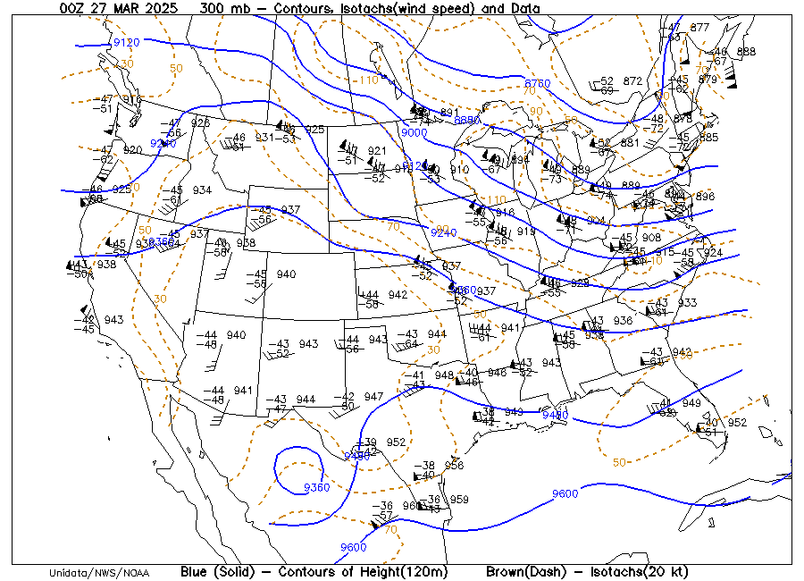
 In this map the isotachs are the brown dashed lines. The lines connect points with equal wind speed accross the country.
 Histograms like this one are used to display frequency. This graph is displaying the frequencies of scores on a 10 question math quiz.
 This is a map that was creatte to show the possible outcome of the election based on polls in the UK in 2005.

Although so different from what we think of maps today stick maps like this on helped the islanders navigate many years ago.


 Contour maps display lines of constant value. This type of map is popular with meterologist in showing the weather. This map shose the expected highs for a parrticular day accross the entire country.
 Being a military wife I had to include this one. This is a dot distribution map showing the distribution of military families in the state of Ohio.
 This climograph shows the monthly rainfall and temperaturs for the year right here in Guam. As the graph shows the temperature here is about the same all year and we have two seasons wet which runs from about June to October and Dry which goes from about November to May.
 A population profile can be displayed in so many different ways. I chose these population pyramids because I think they are a great visualy for this type of data.
 I thought this isobar map seemed a bit different because it shows horizontal isobars. Normally when I have seen Isobar maps the are circular surrounding a pressure system.
 This infrared aerial photo was taken off the coast of California over point loma. It shows a kelp harvest track in the center.
 This is a mental map drawn by someone of what seems to be there home town in Illinois. In an individuals mental map you are able to learn a little about them, it seems that church is something that is important in this persons life.
 Nothing to fancy about this one. This is just a pretty basic Digital Elevation Map of California.


 Windrose charts like this one from Tuscon Arizona make it easy to visualize the wind patterns for an area for a particular month this one is from February. The colors tell the wind speed and the length that the pedal extends tells the pernent of time the wind blows and of course the direction.
 I thought this map was really neat and unique. It shows the world at the start of world war one from an Asian point of view. The map was created in Japan in 1914
 This box plot is from a site about Montana and it shows the Red River discharge for the month of March. The website also includes a chart that give the infomation for April. May, June and July as well.
 This is an example of a star plot. This particular map shows the crime rate in various major US cities.
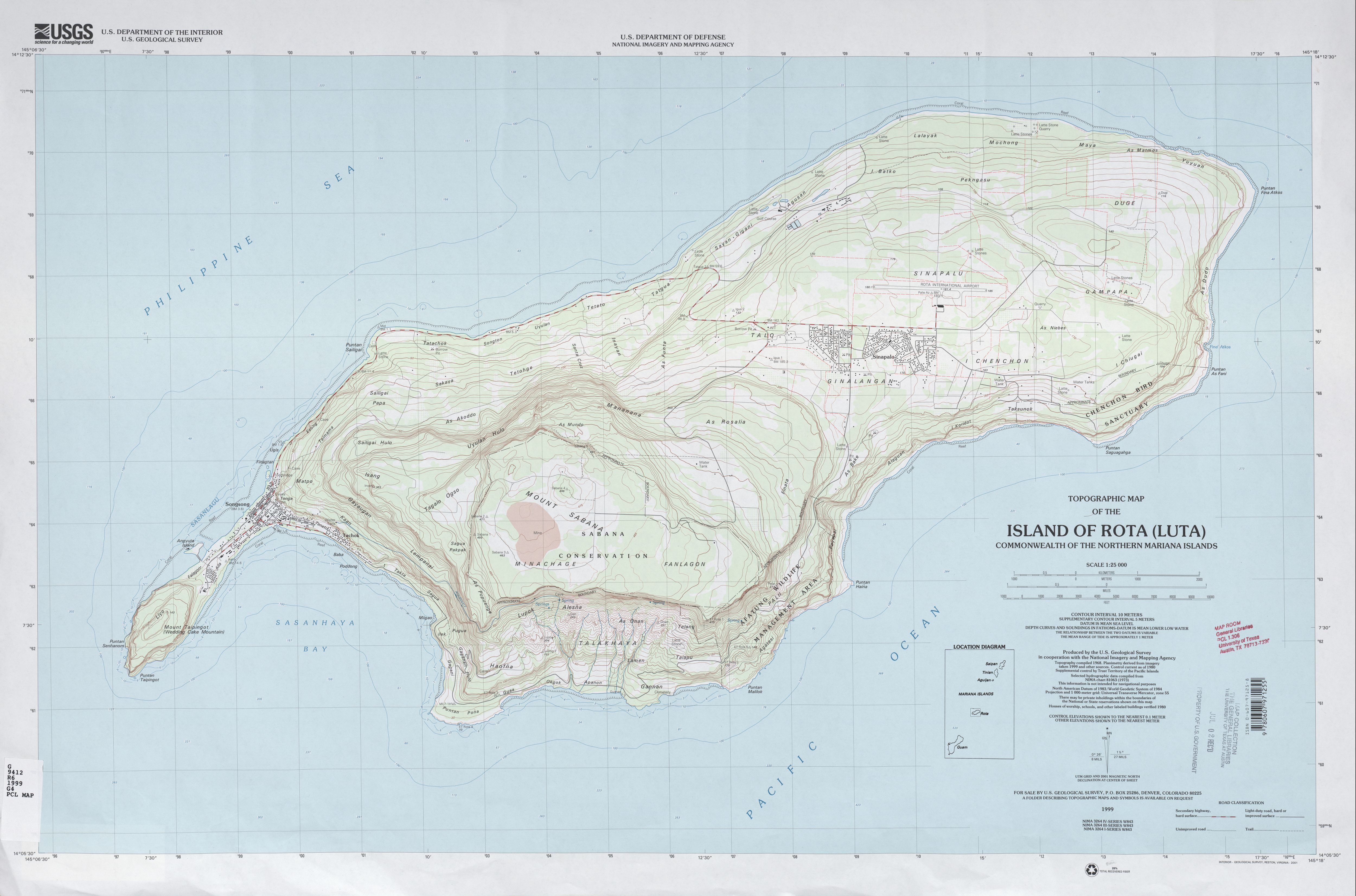
 This is a topographic map of the Island of Rota in the CNMI. What I found interesting is the steep incline on the Southern part particularly the South West side. The North side of the island has a much more gradual incline.
 This PLSS map is of Kirkland Washington. The ellipsoid is Geodetic Reference System 1980 (GRS 80). The horizontal datum is North American Datum of 1983 (NAD 83/91) and the vertical Datum is Vertical Datum of 1988 (NAVD 88).
 This is a Doppler Radar image of Hurricane Andrew as it hit Miami. I like how it has included some street names to really give a feel for where it is. It is interesting to see how different each band is especially with the blackness of the center where the decibels of z are so low then the how quickly it turns to bright red on the complete opposite side of the dBZ scale.

